Most color cosmetics are more than just color, they are about color, look, and coverage. Our brains are processing a lot when evaluating the look of a color product
The color range of cosmetics products is huge. Online stores and retailers around the world have shelves filled with creative shade names and a variety of finishes that leave little to be desired.
Consumers are spoiled for choice when it comes to choosing the perfect product to match their look. While finding the right shade is one side of the story, the “first glance” impression we get from a colorful product can influence the decision to try and buy.
Depending on the consumer’s first point of contact with the product, they will see an online digital swatch, a printed color spot on the shelf, or a package representing the actual product shade.
Or, they are in front of the shelf and see an inspiring bulk color that catches their attention. Seconds later, the actual product application can be surprisingly…unexpectedly different.
There are essentially three factors that influence the color of a cosmetic: color, look, and coverage. Color impressions can be significantly affected by the look factor.
For example, there is a beautiful green pressed powder eyeshadow that reveals color-changing particles once applied and light reflects off the skin at different angles.
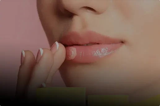
Or, there is this bright orange lipstick that has low bulk coverage so it interacts with the natural lip color to create a beautiful yet different shade.
How can this be technically covered in regards to standardized color measurement? Same for various product types, such as powders, creams, liquids, pens?
Reducing all color and appearance factors to a single color value that can be communicated across all possible consumer touchpoints is challenging.